
I’ll just start by understating the obvious: these are unusual times. The COVID-19 crisis has turned our personal and work lives upside-down as we attempt to flatten the curve. We are all adapting to a new normal that involves social distancing, wearing masks to the grocery store, and seeing a lot more pets and children appear on our work video calls.
I personally dealt with mild symptoms of COVID-19 a couple weeks ago. Three days into feeling like I had a flu, I started feeling my lungs just walking my dog. It was the first time in my life where I could hear a rattle in my chest taking a deep breath. As the panic sank in, I immediately set up a telemedicine call. The symptoms were not severe enough and I wasn’t an at-risk patient…no testing for me. The recovery was a waiting game of rest, fluids, vitamins, and hoping for the best. I’m one of the lucky ones that had a mild case, but it didn’t make it any less scary.
Sheltering in place and fighting the illness gave me some downtime to reflect. I realized I have worked on the designs for a few products that are likely getting a lot of use during this crisis. I designed a “Simplified” UI for the Engstrom ventilator in response to the 2006 Avian Flu scare based on the use case that untrained users may be forced to monitor and maintain patients during an outbreak. I have worked on two different Infection Prevention surveillance tools that are meant to prevent hospital outbreaks. And just in the last few weeks, I’ve been part of the team that built a survey tool for post-acute providers to identify whether they will accept patients from hospitals recovering with COVID-19.
The ventilator and COVID-19 survey projects were especially unique because the primary use case we designed for were worst case scenarios. Usually a scenario like, oh you know…a global pandemic might be considered an edge case. Even though these two products are very different, I noticed there was a common design goal to reduce the users’ cognitive load. A crisis scenario is a stressful situation which makes it critical that any tool being used will not slow down users or cause them to make potentially fatal decisions.
The experiences from these projects helped me realize there are a few key product design strategies that need to be prioritized when considering crisis scenarios. In general, these are smart strategies to consider for any product design initiatives.
Make the design obvious
In a crisis situation, you can’t count on user manuals and training sessions for people to get familiar with your product. People are under a lot of pressure and need to act fast, yet still make good decisions with the information in front of them. A product needs to be very obvious and intuitive right away to support these high stress situations.
The goal for the Care Management COVID-19 survey was to help hospital discharge planners identify post-acute locations to potentially send positive patients. It is very important to free up beds in the hospital during the surge, but not everyone will be healthy enough to go straight home. Sending a patient with the virus to a nursing home that is free of the virus could end up becoming a deadly mistake.
It was really important to make the feature obvious for the users on both sides of the referral communication. For the post-acute providers, we provided a survey to allow someone to quickly indicate whether their site would or would not accept COVID-19 patients. We made the decision to display it as a modal as soon as the application was up. The screen shot below provides clear instructions, shows the current selections, and contains only 5 questions to allow a fast response. It is admittedly a very intrusive design, but the survey will not be missed and can be quickly dismissed if desired. On the main page, we added a banner with red, bold text that clearly states “Click here to take the COVID-19 Emergency Survey” if changes needed to be made to the answers:

The post-acute provider survey in a can’t miss modal. Notice the yellow banner in the background to re-open the survey to make quick updates. (Screen shot from CarePort Care Management)
The “make the design obvious” principle was also used for the hospital discharge planners that are performing searches. The search results can be tedious to navigate if there are a lot of results that appear. I advised the team to use bold, red text to highlight the COVID-19 answers and make them stick out. It may not be pretty, but it is obvious where to identify if the facility will take an infected patient.

The post-acute provider search using bold, red text to make the COVID-19 status stand out. (Screenshot from CarePort Care Management)
Just days after launching the survey, we had 3500 post-acute provider facilities answer the survey and 174 hospitals did a COVID-19 referral search. Those are incredible usage numbers in a short period of time for the product, and they have continued to grow. The “in your face” obviousness of the design was a factor in the high usage.
Prioritize what is most important
In order to reduce the cognitive load in a crisis, there needs to be a focus on what is the most important information someone needs to see. Searching for information only adds more stress to an already difficult situation. This principle is used in the COVID survey with the modal presentation and the red, bold text.
This prioritization focus was also critical in the Engstrom Simplifed UI project. The main use case to consider was the situation we are currently in with COVID-19. What if the normal ventilator operators are overwhelmed and sick? Caregivers that do not normally operate a ventilator may be asked to do so. Not only did we want to make life easier for the novice ventilator users, but we also had to consider viewing the display from a distance in an isolation room. That meant seeing less data on the screen.
While in the conceptual phases of the project, I had an opportunity to interview a couple pulmonologists that were experts in mechanical ventilation. The question was difficult but straightforward: “If you could only have 6 numeric data points what would they be?” The doctors understood their feedback had to highlight the most crucial data needed to assess and maintain a mechanically ventilated patient. The answers were fairly consistent, and I was able to confidently cut the data that would be displayed in half:

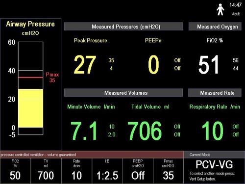
The normal Engstrom ventilator user interface versus the “Simplified UI” that was designed by prioritizing the most important clinical data needed to maintain a ventilated patient.
The normal Engstrom ventilator user interface versus the “Simplified UI” that was designed by prioritizing the most important clinical data needed to maintain a ventilated patient.
The final design testing validated the prioritized data points. The users we brought in were able to quickly and successfully assess the “patient” after a quick 5-minute training. The testing results showed the focus on prioritization also helped make the design obvious.
Know your users
This will seem like obvious advice to any designer. But it amazes me how many times I hear about critical steps in the user research process being skipped. It is really important to understand the day to day life, tasks, and goals of someone using your product in a crisis situation.
Even though I relied on ventilation experts to inform the design for the ventilator project, I couldn’t recruit the normal set of users I was familiar with for design testing. I had to recruit healthcare professionals that are not normally in the ICU. We brought in nurses from a variety of backgrounds, and even had a paramedic come in. The whole point was to test whether the new design was intuitive for someone that didn’t normally operate a ventilator. Knowing their background and medical knowledge (or their lack of ventilator knowledge) was key to understanding whether we were hitting our design goals. Testing with ICU nurses and Respiratory Therapists would have defeated the purpose, and would not have provided the proper design insights.
The Care Management COVID-19 survey was different because it was geared toward our normal user base. The strategy of knowing our users still applied. We already had strong knowledge of the daily workflows, goals, and challenges for both discharge planners and post-acute nurses. We knew they wouldn’t take the time to take a lot of extra steps to update company profiles or provider searches to get their patients placed in the proper locations. The knowledge that comes with years of working closely with our users allowed us the benefit to skip right to product design, which in turn led to a very fast time to market. I wouldn’t normally recommend skipping early conceptual research, but this was an exception we were able to make because of our past focus on understanding our user base.
Bonus tip: Do the best you can testing
It is very difficult to match a real world crisis situation when design testing a product. There is only so much stress that can be artificially created in a controlled environment. The testing for the Engstrom project was done in a lab setting; there wasn’t a critically ill patient and only had one other medical device alarming as a distraction. The COVID-19 crisis was such a distraction for our Care Management clients, that the best we could do to get feedback on the concept was a focus group. Neither situations were close to the ideal, but any feedback is better than none.
In these less than ideal situations, try to simulate as much as you can to the real world scenario. Identify where the limitations are in the testing, weigh out the potential risks of those limitations, and then mitigate the known risks.
Final thoughts
Hopefully this provides insight and helps guide design and product strategy when unique crisis scenarios need to be considered. It helps to write down the design goals early, and then revisit them in the middle of a project to make sure the final product doesn’t stray too far from the original intent.
The realization knowing that multiple products I worked on are being used in the current worst case scenario has been surreal. For all the focus that went into a pandemic situation for the ventilator project, I never really expected for it happen in real life. But here we are. Meanwhile, the last few weeks have been wild with the effort to push the COVID-19 survey out the door while adjusting to our world turning upside down.
I know I haven’t been alone. I have seen a lot of other solutions getting released to help address the crisis. I see the stories of how people are addressing the ventilator and PPE shortages — whether it’s increasing manufacturing or making at home masks. The creativity and empathy on display has been such a bright spot.
Keep innovating…but after you wash your hands!