UX

Take Six with Paul Micheli, Senior Product Manager

Careport highlighted me for their Take Six blog in August of 2020. I am re-posting the interview here:

Tell us more about your role as Senior Product Manager at CarePort. What does your average day look like?
There are a couple things that happen during my typical day. I usually start the day early with a call with one of two offshore development teams in India, one of which I’ve been working with on our new Denial Management module, and the other with which I discuss our ad hoc reporting. These check-ins serve as a time to make sure what the development teams are building, and what I’ve intended for the product, are aligned.

I then have other meetings throughout the day – whether with clients or internally – which could include showing clients or stakeholders new product concepts and receiving feedback, or working on a product roadmap and determining what updates come next.

When I’m not in meetings, I’m either writing product requirements, documenting what’s coming with a new release, or designing new product concepts. Lately, I’ve been spending a lot of time reviewing documentation and working with internal stakeholders to in preparation for our next product release, Care Management 20.2.

What is your favorite aspect of your job?
I love collaborating and working with people. I absolutely love talking to clients – whether learning their problems and workflows, understanding their day-to-day processes, or identifying their pain points. It’s exciting to have new problems to solve.

Once we’ve developed new solutions or product concepts, I like talking to clients to receive their feedback to ensure the product addresses the challenges they’ve discussed with us. I was a user experience designer before working in product management, and speaking with clients and end users was always the most enjoyable part of my job. I enjoy user research, and fortunately I’m able to do that in this role, as well.

I also love brainstorming as a group – particularly during the conceptual phase of product development. I really enjoy collaborating during those early processes, when there are several possibilities to solve a problem and we need to work together to identify a singular solution before moving forward.

What’s next for the Care Management product?
Thanks for asking! The Care Management 20.2 release will be live in August, and it includes two new exciting features. I’ve been working on the Denial Management module, which has been completely redesigned. We have a new front-end technology that we’ve been working with, and it’s the first of – hopefully – many updates to the Care Management platform to ensure that we provide users with a modern and flexible user interface. I know that many of our current Denial Management clients are very excited to see this new offering. I’m looking forward to its launch, and hope that Denial Management improves workflows for clients that are tracking their denials.

The other exciting new feature within Care Management 20.2 is our post-acute authorization feature. This actually a huge release for us! It’s the first time that we’ll have two significant updates happening in one release. Moving forward, we hope to remain innovative and nimble so that we can address the quickly evolving care management market.

What else makes this release unique? Can you tell us about the redesign process?
This has been a long, three-year process. We took a user-centered design – or design thinking – approach for this. We spent a lot of time interviewing managers and end users, both on- and off-site. We did a six-month research effort to better understand how the legacy denials module was used, and I listened to feedback from clients and internal stakeholders. I like to call myself the “dartboard” on products like that: throw all of the darts at me, I will listen and I then figure out how to improve it.

We also worked with a UX designer for quite a few months to develop different design concepts, and we took those concepts to our clients for feedback before finalizing and moving forward. There were a couple false starts on the technology side – trying to find the right technology that would fit the solution.

It’s taken a lot of patience and persistence, but I feel like we did things in what I would call the “right” way. By identifying clients’ challenges to better understand what they were going through, we put our users first. I think the outcome is going to be fantastic for our clients. There’s a lot of buzz, internally and with the clients that I work with, about this release. I hope that, in the future, we follow this design thinking approach for all of our initiatives and major releases.

What’s something about you that coworkers would be surprised to learn?
Over the last year and a half, I’ve taken improv classes at The Second City, and I completed their improv program in October 2019. It’s been a fun process! I initially signed up because I thought it would be a good way to become a better public speaker – and be quicker on my feet – but I absolutely fell in love with it. I’ve met amazing people, and it’s been a great way to make friends – including a lot of very funny people from all walks of life. At first, I was petrified to go on stage… growing up, I never did drama or school plays. The first time I went on stage and performed a 15-minute show, however, it was a huge growth experience for me. From that moment on, I’ve been addicted to improv and have looked for any opportunity to perform. It’s probably the thing I’ve missed the most during COVID-19, which has been hard. I’m hoping that world will open up again sometime soon. In the meantime, I’ve tried to do some comedy writing in my free time.

What are your hobbies outside of work?
I try to keep myself really active, and I’m very outdoorsy. I ran a half Ironman the past two summers, and I used to run marathons. Unfortunately, there’s no racing going on right now – so I try to make up for it with more hikes, camping, stand-up paddle boarding and visiting local forest preserves outside Chicago. I have a dog named Biscuit, and I like to bring her along with me.

I recently went to Michigan and visited Sleeping Bear Dunes National Lakeshore. I did a brutal hike – two miles each way, climbing nothing but sand dunes to get to the water. I’ve done some pretty intense mountain hikes in the past, but this was one of the hardest hikes I’ve ever done. It was amazing once I reached the water and could cool off, but then I realized I had to do the two-mile trek in the hot sand back to the parking lot!

To learn more about what Paul’s been working on, read our recent blog post about our Denial Management offering, which lives within CarePort Care Management.

How to Design for a Crisis

I’ll just start by understating the obvious: these are unusual times. The COVID-19 crisis has turned our personal and work lives upside-down as we attempt to flatten the curve. We are all adapting to a new normal that involves social distancing, wearing masks to the grocery store, and seeing a lot more pets and children appear on our work video calls.

I personally dealt with mild symptoms of COVID-19 a couple weeks ago. Three days into feeling like I had a flu, I started feeling my lungs just walking my dog. It was the first time in my life where I could hear a rattle in my chest taking a deep breath. As the panic sank in, I immediately set up a telemedicine call. The symptoms were not severe enough and I wasn’t an at-risk patient…no testing for me. The recovery was a waiting game of rest, fluids, vitamins, and hoping for the best. I’m one of the lucky ones that had a mild case, but it didn’t make it any less scary.

Sheltering in place and fighting the illness gave me some downtime to reflect. I realized I have worked on the designs for a few products that are likely getting a lot of use during this crisis. I designed a “Simplified” UI for the Engstrom ventilator in response to the 2006 Avian Flu scare based on the use case that untrained users may be forced to monitor and maintain patients during an outbreak. I have worked on two different Infection Prevention surveillance tools that are meant to prevent hospital outbreaks. And just in the last few weeks, I’ve been part of the team that built a survey tool for post-acute providers to identify whether they will accept patients from hospitals recovering with COVID-19.

The ventilator and COVID-19 survey projects were especially unique because the primary use case we designed for were worst case scenarios. Usually a scenario like, oh you know…a global pandemic might be considered an edge case. Even though these two products are very different, I noticed there was a common design goal to reduce the users’ cognitive load. A crisis scenario is a stressful situation which makes it critical that any tool being used will not slow down users or cause them to make potentially fatal decisions.

The experiences from these projects helped me realize there are a few key product design strategies that need to be prioritized when considering crisis scenarios. In general, these are smart strategies to consider for any product design initiatives.

Make the design obvious

In a crisis situation, you can’t count on user manuals and training sessions for people to get familiar with your product. People are under a lot of pressure and need to act fast, yet still make good decisions with the information in front of them. A product needs to be very obvious and intuitive right away to support these high stress situations.

The goal for the Care Management COVID-19 survey was to help hospital discharge planners identify post-acute locations to potentially send positive patients. It is very important to free up beds in the hospital during the surge, but not everyone will be healthy enough to go straight home. Sending a patient with the virus to a nursing home that is free of the virus could end up becoming a deadly mistake.

It was really important to make the feature obvious for the users on both sides of the referral communication. For the post-acute providers, we provided a survey to allow someone to quickly indicate whether their site would or would not accept COVID-19 patients. We made the decision to display it as a modal as soon as the application was up. The screen shot below provides clear instructions, shows the current selections, and contains only 5 questions to allow a fast response. It is admittedly a very intrusive design, but the survey will not be missed and can be quickly dismissed if desired. On the main page, we added a banner with red, bold text that clearly states “Click here to take the COVID-19 Emergency Survey” if changes needed to be made to the answers:

The post-acute provider survey in a can’t miss modal. Notice the yellow banner in the background to re-open the survey to make quick updates. (Screen shot from CarePort Care Management)

The post-acute provider survey in a can’t miss modal. Notice the yellow banner in the background to re-open the survey to make quick updates. (Screen shot from CarePort Care Management)

The “make the design obvious” principle was also used for the hospital discharge planners that are performing searches. The search results can be tedious to navigate if there are a lot of results that appear. I advised the team to use bold, red text to highlight the COVID-19 answers and make them stick out. It may not be pretty, but it is obvious where to identify if the facility will take an infected patient.

The post-acute provider search using bold, red text to make the COVID-19 status stand out. (Screenshot from CarePort Care Management)

The post-acute provider search using bold, red text to make the COVID-19 status stand out. (Screenshot from CarePort Care Management)

Just days after launching the survey, we had 3500 post-acute provider facilities answer the survey and 174 hospitals did a COVID-19 referral search. Those are incredible usage numbers in a short period of time for the product, and they have continued to grow. The “in your face” obviousness of the design was a factor in the high usage.

Prioritize what is most important

In order to reduce the cognitive load in a crisis, there needs to be a focus on what is the most important information someone needs to see. Searching for information only adds more stress to an already difficult situation. This principle is used in the COVID survey with the modal presentation and the red, bold text.

This prioritization focus was also critical in the Engstrom Simplifed UI project. The main use case to consider was the situation we are currently in with COVID-19. What if the normal ventilator operators are overwhelmed and sick? Caregivers that do not normally operate a ventilator may be asked to do so. Not only did we want to make life easier for the novice ventilator users, but we also had to consider viewing the display from a distance in an isolation room. That meant seeing less data on the screen.

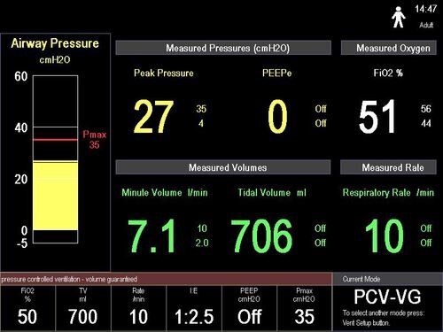
While in the conceptual phases of the project, I had an opportunity to interview a couple pulmonologists that were experts in mechanical ventilation. The question was difficult but straightforward: “If you could only have 6 numeric data points what would they be?” The doctors understood their feedback had to highlight the most crucial data needed to assess and maintain a mechanically ventilated patient. The answers were fairly consistent, and I was able to confidently cut the data that would be displayed in half:

Engstrom 1.jpg
engstrom 2.jpeg

The normal Engstrom ventilator user interface versus the “Simplified UI” that was designed by prioritizing the most important clinical data needed to maintain a ventilated patient.

The normal Engstrom ventilator user interface versus the “Simplified UI” that was designed by prioritizing the most important clinical data needed to maintain a ventilated patient.

The final design testing validated the prioritized data points. The users we brought in were able to quickly and successfully assess the “patient” after a quick 5-minute training. The testing results showed the focus on prioritization also helped make the design obvious.

Know your users

This will seem like obvious advice to any designer. But it amazes me how many times I hear about critical steps in the user research process being skipped. It is really important to understand the day to day life, tasks, and goals of someone using your product in a crisis situation.

Even though I relied on ventilation experts to inform the design for the ventilator project, I couldn’t recruit the normal set of users I was familiar with for design testing. I had to recruit healthcare professionals that are not normally in the ICU. We brought in nurses from a variety of backgrounds, and even had a paramedic come in. The whole point was to test whether the new design was intuitive for someone that didn’t normally operate a ventilator. Knowing their background and medical knowledge (or their lack of ventilator knowledge) was key to understanding whether we were hitting our design goals. Testing with ICU nurses and Respiratory Therapists would have defeated the purpose, and would not have provided the proper design insights.

The Care Management COVID-19 survey was different because it was geared toward our normal user base. The strategy of knowing our users still applied. We already had strong knowledge of the daily workflows, goals, and challenges for both discharge planners and post-acute nurses. We knew they wouldn’t take the time to take a lot of extra steps to update company profiles or provider searches to get their patients placed in the proper locations. The knowledge that comes with years of working closely with our users allowed us the benefit to skip right to product design, which in turn led to a very fast time to market. I wouldn’t normally recommend skipping early conceptual research, but this was an exception we were able to make because of our past focus on understanding our user base.

Bonus tip: Do the best you can testing

It is very difficult to match a real world crisis situation when design testing a product. There is only so much stress that can be artificially created in a controlled environment. The testing for the Engstrom project was done in a lab setting; there wasn’t a critically ill patient and only had one other medical device alarming as a distraction. The COVID-19 crisis was such a distraction for our Care Management clients, that the best we could do to get feedback on the concept was a focus group. Neither situations were close to the ideal, but any feedback is better than none.

In these less than ideal situations, try to simulate as much as you can to the real world scenario. Identify where the limitations are in the testing, weigh out the potential risks of those limitations, and then mitigate the known risks.

Final thoughts

Hopefully this provides insight and helps guide design and product strategy when unique crisis scenarios need to be considered. It helps to write down the design goals early, and then revisit them in the middle of a project to make sure the final product doesn’t stray too far from the original intent.

The realization knowing that multiple products I worked on are being used in the current worst case scenario has been surreal. For all the focus that went into a pandemic situation for the ventilator project, I never really expected for it happen in real life. But here we are. Meanwhile, the last few weeks have been wild with the effort to push the COVID-19 survey out the door while adjusting to our world turning upside down.

I know I haven’t been alone. I have seen a lot of other solutions getting released to help address the crisis. I see the stories of how people are addressing the ventilator and PPE shortages — whether it’s increasing manufacturing or making at home masks. The creativity and empathy on display has been such a bright spot.

Keep innovating…but after you wash your hands!

My Favorite Three Product Experiences in 2016

Let's face it, 2016 has not been the easiest year. I'm writing this day after we lost Princess Leia, and everyone seems ready for the ball to drop in Times Square in a couple days. At least my beloved Cubs ended their long championship drought.

To balance out the negativity, I felt like sharing some positive during the year in the form of some amazing products. These are examples of products that stood out to me as a User Experience specialist. And no, I was not involved with these products in any way (although I wish I was).  

Hala Stand Up Paddle Boards:

Over the summer, I was invited out to do a little Stand Up Paddleboarding (SUP) and quickly realized how much I missed being on the water with a paddle in my hand. I decided I was going to invest in an SUP and get myself on the water as much as possible. I knew I wanted an inflatable board for storage purposes, but I didn't know much else. The local retailer showed me the Hala SUPs, and I immediately fell in love. 

What immediately struck me was the backpack that comes with the board. Most of the other boards come in duffle bags that look like they are difficult to carry around. The Hala SUPs come with a backpack that also has wheels. This allows the paddler to carry it just about anywhere at 20 some pounds, or to drag it through the airport for the epic trip they are about to embark on. The idea of taking the board up to a lake 2 or 3 miles from civilization just triggered my outdoorsy sense of adventure. And what a bonus if I wanted to bring it along on a trip that was a bit too far to drive. 

I can tell you that this SUP got the job done when I went a few miles up a dirt road to a lake in the middle of the San Juan mountains. In just minutes, I was on the water enjoying the solitude. And when it looked like the weather was going to turn, I was packed up within minutes and driving away.

Every time I was on the board this summer, I felt like someone was reading my mind when they designed the board and the backpack. It is easy to tell the product is targeted for that adventurous, loves to travel paddler. The designers at Hala did their homework in understanding their users, and developed a product that I know I will enjoy for many summers. 

Progressive's Mobile App:

One of the low points of 2016 for me was getting rear ended in a car accident in stop and go traffic. Luckily there were no injuries, but it is still a scary experience to be in that situation. As we waited for the patrolman, I started thinking about insurance, getting my car fixed, and what a pain the whole thing was going to be. 

I opened up my Progressive phone application so I could exchange my insurance information with the other driver, when I noticed there was a menu selection to start a claim. Interesting...I could get my accident claim started right there on the side of the road. All I had to do was answer a few easy questions about the accident. Then it allowed me to take pictures of the damage as part of the claim report. I clicked the pics with my phone, and within 5 minutes of opening up the app my claim was submitted. 

Did Progressive have all the information they needed for the claim? No. But they called me the next day to gather what they needed from me. What impressed me was that they kept the questions simple, and it kicked off the whole process with very little thinking on my part. Wondering if my back was okay and if the passengers in the other car were fine was a much larger priority for me than filling out a detailed set of questions about the crash on my phone. 

The application asked for just what was needed in a stressful situation. It did not add any stress to my situation. The fact I was so impressed with the design in that moment should say a lot to group that built and designed just enough and not anything more. 

Barracuda Luggage:

A friend of mine showed me their new Barracuda luggage while in Chicago recently. I was immediately blown away, and was lucky enough that someone checked it off my Christmas wish list. 

This luggage is a travelers dream. Are you tired of searching for a place to plug in your phone at the airport? It comes with a battery pack in the suitcase. Having trouble finding a place to store your luggage? It is collapsable and comes with a bag that you can hang up in your closet. Airline lose your luggage? GPS tracker! And I haven't mentioned the nice, ergonomic handle that makes it a little easier to navigate those tight crowds. 

I can tell someone who has had a lot of headaches while traveling really thought through these problems. It is another example of a product where I feel like someone was in my head and knew exactly what I needed before I realized it. Suddenly, I'm looking forward to traveling more...even if that means more TSA in my life. 

Bottom Line:

The common thing that brought my attention to these three products was how much they grabbed my attention with a great User Experience. It is easy to notice a bad design and complain about a bad product. It is also easy to overlook a good user experience, because it is almost invisible and just fits what someone needs. To feel like someone interviewed me as part of the user research process for their product is a testament to the hard work that had to go into it. 

I'm all about doing my homework when it comes to User Research within UX. I feel like a lot of places are forgetting this or shortcutting this process. So a tip of my hat to these three products that made my 2016 a little better. 

Which Design Tool? Does it matter?

I have already written about the importance of knowing which tool to use in User Experience when discussing Personas. The design process can vary depending on the context of the problem to identify and solve, and it takes a little trial and error to figure out what to use in a specific situation. Lately, I have seen a lot of debate online about which design tools are better:  Axure, Omnigraffle, Balsamiq, the Adobe Suite…even whether or not a designer needs to be proficient in HTML/CSS and JavaScript. 

I believe it is similar to choosing the right tool while doing construction: it really depends on the context of the situation. 

When choosing which design tool is best for you, there are some important questions to consider. Here is a good checklist to get started:

  • What are the goals for this particular project? 
  • How much time is allotted?
  • Who is the audience of this particular design? 
  • Is the purpose to gather feedback on a new concept or usability test a baked out feature? 
  • What is the budget? 

If the need is for a hi-fidelity prototype then take the time to learn Axure or HTML/CSS. Balsamic and Omnigraffle are more than adequate to get wireframes “on paper”. A white board is a fantastic tool to sketch out new ideas in a collaborative space. I personally have had a lot of success designing in Powerpoint - even with interactive click points. With all these options, I wonder if it really matters which design tool is used. 

In my opinion, the most important outcome of a design artifact is that it starts a conversation. Whether it is with your Product Manager to put some visuals around a concept, a detailed design artifact for a User Story that the developers are going to work on, or the end-user who is validating the design through usability testing. All of these scenarios should lead to two conversations 1) whether or not the design is moving in the right direction to solve the problems at hand and 2) how to improve the design to get to the right solution. 

I have to agree with this Tweet from Patrick Neeman (find the tweet) when it comes to this discussion:  

_If_you’re_focusing_on_the_tool_you_use__you’re_focusing_on_the_wrong_thing__.jpg

Getting caught up in which design tool is better or if you are using the right one takes away focus on the design and the design process. I would prefer to focus on collaborating with my colleagues to identify and solve the correct problems instead. I enjoy expending my energy on meeting the end users whose lives I am trying improve. 

So if you’re having the right conversations, improving your designs, while meeting the project goals - then you’re probably using the right tool for the job.

What Automobile Technology Evolution has helped me realize about Health IT, UX, and Patient Safety

My source of inspiration

My source of inspiration

It is amazing (and sometimes scary) what can go through our minds during a solitary drive. While taking a solo road trip through beautiful southern Utah, I starting thinking about cars. I guess it makes sense seeing that I had been in one for hours as I was approaching Bryce Canyon National Park. I felt a lot of appreciation for some of the safety features that I did not have on my previous cars like the rearview camera, proximity sensors for merging, and bluetooth to safely handle incoming phone calls. I was in awe over how much the automobile has really evolved. 

There were already a variety of different steam and gasoline powered cars that had been invented before Henry Ford came along to introduce the fairly affordable Model T in 1908. Those initial Model T’s had no wheel brakes, optional windshield wipers, no radio, all while having a max speed of 45 mph. I’m guessing it was a heck of an upgrade from getting around on horses. 

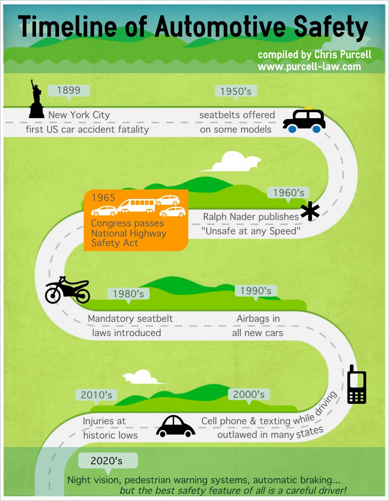
From a safety perspective, the evolution of the automobile was fairly slow: seat belts were not a standard feature in any car until Saab did it in 1958. Not that it mattered much since it took nearly another 30 years for them to be required by law in the United States. The progression has seemed to move faster since the first airbags were added in the 1990s. Now we have those cameras and proximity sensors. Human error may be removed completely in the near future since we may not have to even manually drive cars

That is not to say driving a car is still a perfectly safe endeavor. Accidents still happen. Console designs can still use a little work. One of my friends recently shared her story of a near accident while she was changing the internal temperature. Instead of a knob, the control was a button that required more of her attention which was not on that other car on the road. After over 100 years of evolution that has given us some amazing achievements, safe driving technology still has not been perfected. 

This mini-revelation got me thinking about healthcare IT, patient safety, and User Experience. On their own, each of these fields are still relatively new:

  • EMR giant, Epic, was founded in 1979. 
  • The first book on usability that I ever read was Jakob’s Nielsen’s “Usability Engineering”, which was first released in 1993. Don Norman’s “The Design of Everyday Things” was published 7 years earlier. 
  • The infamous "To Err is Human: Building a Safer Health System” report that launched numerous patient safety research initiatives just turned 15 last year. 
  • And the stimulus package that created the Meaningful Use initiative and boosted the Health IT world was passed in 2008. Which is around the same time I first heard the term “user experience”. 

I have been working in the unique crossroads of Health IT, Patient Safety, and UX for over 10 years. It has certainly been a chaotic ride. I have often wondered how many more stories from clinicians about the poor usability of their software that I can stomach to hear. How much longer can I continue to beat my head against the wall as I see designs cut down due to technical and business constraints. How much more finger pointing between clinicians, hospitals, and vendors will continue on as the patients have little say on the situation. 

The reality is: These are still young fields, and I have been living in their adolescent phases. Of course it is chaotic. Of course there are complaints about HIT usability. Of course the culture change that has to follow rapid technology advances feels like it is moving like a glacier. If 100 years of automobile evolution hasn’t made driving a perfectly safe endeavor, how is it possible we have made Health IT perfectly safe and usable in 20-30 years? 

Looking at the big picture, amazing steps have been taken in these last 10 years. I am so much more efficient at wireframe design and recording usability tasks because of the tools now available to me. There are companies with Chief Experience Officers. There are many new organizations that are focused on patient safety initiatives and health IT improvements. The occurrence of ICU blood stream infections has decreased. Good user-centered design practices are no longer a nice to have in healthcare, but have become a competitive necessity. If you like to follow the money - over $4 billion was invested in digital health start ups last year! And frankly, my Twitter feed is overwhelming most days when I look at the amount of information that is available to me in just seconds. 

I guess if I took anything away from my road trip, it’s that I need to not be so frustrated that the junction of health IT, UX, and patient safety are not in this ideal place where I want it to be. We have come a long way, but there is a lot more work to be done. All of us - clinicians, health systems, vendors, designers, developers, etc - have to work together to evolve our fields in the right direction. Just the fact that the AMA is asking the ONC to change EHR certification to focus on “usability, interoperability, and safety” shows me that we are indeed continuing to evolve. So let’s roll up our sleeves, stop pointing fingers, focus on the patients that need our help, and go build great healthcare products!

I am really excited to see where this evolution will bring us in ten years…

Do Your Users Trust Your Software?

I always enjoy the opportunity to pick the brain of a healthcare provider and get their perspective on all things Health IT. I received a bit of enlightenment in a recent conversation with a clinical informaticist. We discussed Meaningful Use, interoperability, “big data”, and other topics that are creating a buzz in healthcare. Our conversation eventually moved to User Experience, and I was pleased to hear he is a big fan and supporter of UX. As we discussed the importance of building usable software, he made an interesting statement (which I’ll paraphrase): 

“All those nice designs and patterns don’t matter if the clinicians don’t trust the data in the system.”

The statement was focused on the importance of data integration and interoperability. But the word “trust” really caught my attention, causing me to pause and reflect. Building trust has always been in the back of my mind when I’m designing, but it is easy to forget about it during the daily grind of throwing together wireframes, gathering design feedback, and working with development teams. The problem of the day can narrow focus to the point where I’m looking at a single leaf in the forest. This was a reminder of one of the necessary goals in providing a solid user experience solution. 

Building trust in software is especially important in healthcare. As I learned through many early career interviews with anesthesiologists, healthcare providers do not want to deal with a “black box” when it comes to technology: “Why is the system alarming?” “What is wrong with my patient?” “Is your system giving me the right information I need?” There is already enough stress in providing proper care. The last thing they need is to question whether their software is providing the right information in the right context. 

The bottom line is no matter what the application does, how many features it has, and how “nice” and well designed it looks: if the users cannot build trust with the system they will not use it.

There are no shortcuts in establishing trust. It is something that needs to be prioritized in the design process. I believe a key factor is to focus on the initial intuitiveness of the application to help make a good first impression. Eventually, steps have to be taken to maintain that trust over time. 

Here are some suggestions on how to go about building up that trust:

  • Do your research: I bring this up all the time when discussing UX. Without doing the proper user research, you will not be able to identify where users may be having issues trusting your application. Do not design in a vacuum. While you are researching:
    • Run “hallway tests”: Grab a co-worker (or neighbor, or friend, or family member…anyone really) and have them look at your low-fidelity design. Do they know what they are looking at? Can they figure out what to do? If not - time for some rapid design iterations before grabbing the next unsuspecting test subject.
    • Test with new users: First impressions go a long way, and users that are new and unfamiliar to your system are ideal to test how intuitive an application is. New users should be able to navigate and work their way through a well-designed, intuitive application with very little problems. Some errors may initially be expected if the software is particularly complex, but you should observe those errors occurring less and less. If they are still struggling after the second or third task in a usability test, then it may be time to go back to the drawing board. 
  • Provide guidance: Sometimes the task at hand is going to be a little too complex to accomplish without a little help. Great software will provide well placed help text, tutorials, or other guides to help the user navigate through successfully. One of my favorite guides are the videos on my Macbook that show me how to use the trackpad for tasks like bringing up Mission Control and Launchpad. I recommend working closely with whoever is writing up the product documentation to brainstorm creative ways to help users learn the system. 
  • Follow up: Not only do you have to make a good first impression, but you have to keep working and improving to maintain the trust that was gained. Go back and follow up with users that have evaluated your designs. Hopefully the latest application updates addressed the issues they had, and you will be having much happier conversations. Follow up discussions are always a great chance to find new improvement opportunities. But this is also important in order to establish a personal rapport. Users appreciate this attention and knowing that you care about their experience.

Following a good user-centered design process and having empathy for users will naturally make these suggestions much easier to accomplish. I think the effort is worth it - I would much rather have people using the products I have helped design.

My Favorite UX Tool

I have enjoyed watching the maturity of the UX field over the years. When I went from curious observer to Usability Engineer, the only tools I had were PowerPoint for design and a Usability Study template to test those designs. Over ten years later there are a wealth of applications and research techniques available in the UX Designer’s toolbox. As exciting as it is to see this growth, it can be be overwhelming as well. Like a plumber or carpenter, it takes years of practice to know what to grab out of the toolbox for the task at hand. Through my years of experience I have found my favorite to pull out of the UX toolbox are Personas. 

It may seem interesting to some that I would pick a deliverable which causes debate on how much value it truly adds. I believe when created well and utilized appropriately, Personas are a key factor to building a successful User Centered Design process. In a way, it is logical: Personas are representations of actual users. And User Centered Design is…well, design that is centered around the users and their needs. 

I have had a lot of success using Personas as a way to train my teammates on our users. When I present a new one to my teammates, I make sure I explain who provided the inspiration behind them. Their goals, their frustrations, and why they are using our product are all highlighted. A well presented Persona can save everyone a lot of tedious usability study recordings, and yet still get a feel for what makes the users tick. 

Not only are Personas great for raising user awareness on the development team, but I have seen them used successfully in other departments. Service and Support managers utilize Personas I have written as part of their new employee training. One of the coolest and most bizarre moments of my career was watching a Product Manager put on a wig and act like one of our Personas as part of a Sales Training course (he nailed it). Admittedly, watching one of our salesmen sweat during this exercise while painfully losing "the deal" with one of our more sassy Personas was kind of fun. 

I am not going to spend a lot of time on the basics of writing Personas. There are plenty of templates out there that serve as a good starting point (just Google Persona templates). I will provide 4 tips on how to make your Personas great:

Make sure your Personas are based on people you have met:

This may seem obvious, but it can be obvious when a Persona is based on assumptions and second hand information. Using only secondary research and assumptions will lead to a generalized Persona that is hard to relate too. A big part of the reason to use Personas is to help the team identify and empathize with the users. There is no need to make the difficult climb to a User Centered Design environment that much harder. It is also difficult to identify and prioritize user needs around a Persona that is too general. Generalized Personas are usually a sign of a lack of focus on priorities. 

Get out there and talk to the people living and breathing your product on a day to day basis. I actually believe you can create a great Persona just talking to 1 or 2 people. Some will say you need to talk to 5-7 people, but I would suggest creating a second Persona so you can capture some of the differences in personalities of your user base. Face to face interviews are ideal, because it is easier to pick up on the personality quirks that make each and every one of us unique…and thus making your Personas unique. 

Capture the Emotions:

To quote Amy Cueva, “Emotions matter”. None of us are robots, and neither are any of your users. (Although, it might be cool if we re-check this statement in about 10-20 years.) Sticking to the facts about a job does not really capture the reality of the situation. People get frustrated when things do not work well, and get a great feeling of satisfaction when they accomplish a difficult task. Avoiding the negative emotions and finding ways to trigger the positive emotions are part of the goal of good Experience Design. 

Capture these emotions as part of the Persona write up. Tie them to their work goals. Write a narrative about their daily life. What makes this person get out of bed in the morning? What are their aspirations? How can the experience you are designing make their day better? A great story captures the attention of your audience and helps get better buy in for a design. The most powerful healthcare presentations I have attended usually involve a story of how a medical error damaged someone’s life. 

Now you have some Experience Goals to focus on along with your prioritized user needs.

Do not let your Personas get stale:

People change and so should Personas. As a product matures and changes, so will the use of the product. A mistake I have made is putting up Persona posters in my office, and then leaving them there. If it appears that I forgot that I put them there, why should I have expected my teammates to remember them as well?

Ideally, Personas are called out in requirements and user stories so they cannot be forgotten. Regular check-ins with teammates to make sure they understand which users and their needs they are addressing helps as well. I recently started writing, “what am I thinking today” thoughts for my Personas as a way to share recent feedback from User Research Interviews. If you have a Persona named Beth, then start a “WWBD” campaign to raise awareness. 

Personas are not a Primary Research replacement:

The interviews have been conducted, the Personas are written, and the development team is buying into them. No need to keep up the User Research, right? Wrong! User Research never stops, and nothing can replace the power of interacting directly with your users. The market is always changing, meaning the goals of your users are probably evolving as well. Getting complacent can cause a big miss in learning about new user needs and requirements. Get out of the office!

In Conclusion:

Following these steps can help create a very powerful tool to pull out of the UX toolbox. My favorite aspect of Personas: they are a great empathy builder. Telling a good story, capturing emotions, and even role playing have made this a very fun way to help my teammates realize there are real people out there relying on us. And ultimately for UX, it is about the people we’re designing for.

Prioritize Design with Principles

In the world of software things rarely work out in an ideal fashion. This is especially true when operating as a UX “army of one”. My experience as the lone UX Designer has taught me that I cannot accomplish everything UX in the same manner as I did when I was part of a great design team. User Research reports turn into executive summaries, fewer design concepts get developed, and other UX deliverables become nice to haves that just don’t happen. Through the frustrations I have learned the importance of prioritization and focus. 

One of those UX deliverables that becomes a nice to have is a UI Design Pattern Library. Design Pattern Libraries are a great tool to promote consistency across a product or an enterprise of products. When done well it can lead to a smoother, easier to learn user experience. However, they take a very long time to develop making it very hard for one UX designer to give it the focus it needs. 

I was glad to see Peter Hornsby’s recent UX Matters article on using Design Principles over standards and patterns. Not only is creating a Pattern Library a lot of effort, but I have to agree that patterns can lock designers and developers into the way things have always been done. I believe that User Experience is a group activity. Which is why I like to encourage developers to challenge my designs, and find ways to deliver the best possible user experience within our technical constraints.

Design Principles create a foundation for the open ended discussion that pushes for a better experience. They become a guide during design reviews. When tied to specific emotions, they can help build empathy for the users within the team. And ultimately, they can help create a desirable design culture.

Here are a few simple design principles that I particularly like to live by. These are inspired by Lean UX principles, the HIMSS elements of a usable EMR, and over 10 years of design experience:

  • Safety First: This one is the most important principle in the healthcare domain, as patient lives are at stake when software or a medical device is not run properly. Design solutions need to make sure we protect our users from causing themselves or others harm. It should be hard to make errors, yet easy to recover from them.
  • Know who you are designing for - This is one of my favorites as it focuses on the importance of User Research. Know the personas, their goals, their workflow, and have empathy for the roadblocks they come across. 
  • Build what is relevant – A good design solution solves a specific problem or problems that have been well researched. Do not build “cool” features that do not solve an actual problem - that seems to only work for Apple and social media applications. This principle goes hand in hand with keeping the designs simple so as to not overwhelm users with information overload
  • Prioritize! – Once you know what is relevant, focus on the primary tasks and the important data needed to complete those tasks. Make the most critical data easy to see and access, and show anything secondary elsewhere to reduce clutter. This is another principle that relies heavily on solid User Research and keeping designs simple. 

This is by no means a complete list. These principles are some of my favorites that I work with to deliver usable designs. I like to keep them simple, sweet, and easy to explain. I also make them easy to see by placing the list in places where the development teams have their meetings. 

Bottom line - a solid set of principles are very important tool in the UX toolbox, especially for the lone UX designer.

Building Empathy to Reduce Load Times

I don’t think anyone would debate with me that we live in an inpatient, instant gratification society. Technology has come such a long way that we get frustrated whenever something requires waiting. One of my favorite comedians, Louis CK, hilariously explains it: 

I will admit, a few extra seconds to wait for my fantasy football team to come up on my phone is really not the end of the world. But there is evidence that slow load times to access a site or application can lead to a poor experience. This slowness can cause someone to give up, leading to a lost sale on a retail site. In healthcare, this could mean less time a physician is focused on a patient during a visit or a pharmacist reviews fewer potential medication interventions during a day

Improving application performance and load times usually means tackling technical debt, which tends to be pushed backwards in product priority. So how does one go about showing the importance of fixing these issues? 

Make the product managers, developers, analysts, and testers really feel the pain to raise the level of empathy for the users. I have tried a little activity to help show the pain caused by slow load times. I call it the “Stop Watch Game”:

I presented a few colleagues a user scenario that involved running a search. I started simple: assume you are one of our users, and you need to create a list of patients on a specific medication in your facility. I instructed them to imagine they have pushed the Run/Load button when I say “go”. They wait and tell me when they would expect the result to load by saying “stop”. This was not done with the application up and running - just hypothetical. Using the stop watch on my phone, I timed the “go” and “stop” commands. My colleagues typically would let the simple queries only go between one and two seconds. I informed them of the reality by starting the stop watch, saying “go”, and then letting the clock run until the real average load time on our application came across. 

I could start to see the awareness by their impatience during that second round of this game. This exercise was even more powerful when I presented a search scenario involving a complex report where load times are naturally going to be longer. Once again, they expected quicker load times then the current reality. The Nielsen/Norman article states that at 10 seconds the user will get distracted and want to move onto other things. So naturally, I said “go” and made everyone sit there for 10 seconds. Talk about a fidgety group. I finally asked the group if they thought that maximum allowable load time was really good enough. 

I’ll admit a couple things: this really isn’t a very fun “game”, and there are other ways to build empathy for users in UX. Ideally, I would have everyone sit in on my usability studies and listen directly to the feedback from our users. Outside of how uncomfortable it would be to have 10 people watch you do your job, the reality is not everyone outside of UX has the time for observing that many studies. Sharing the results and videos from a study can also help, but I have found that is not as engaging as seeing it real time. 

I did the “Stop Watch Game” in a requirements meeting when acceptable load times for a feature became the topic of discussion. At the end of the meeting I had buy in from the team that they would include appropriate, yet realistic load times in the acceptance criteria and they would test to the metrics. I was able to sell the importance of taking on some technical debt in 10 minutes, without having to show videos of inpatient users. 

I like to call activities like this “empathy builders”. Building empathy with colleagues is such an important part of the User Experience process. I have found sharing the pain users have with not so usable software seems to resonate with colleagues more than metrics and usability requirements. 

If playing with a stop watch for 10 minutes is a way to build that empathy to improve the usability  of a product…then I’ll take it.

The Best Career Advice I Recieved

I was recently asked by a friend what was the best advice I have received in my healthcare career. My first thought was “wow, that’s a tough question!” As I was racking my brain, I could have come up with something cliche like “be passionate about what you do” or “be comfortable saying you don’t have the answer”. As I was cycling through my brain, I suddenly flashed back to an early point in my career:

“If you don’t spend time in their environment, how will you know how users really use your product?”

To give some context, I was very new to the world of User Interface design and was the lead Usability Engineer for a critical care ventilator. I was working with designs coming from the anesthesia device product line to promote consistency between the products and to ease the cost of development. The Product Manager shared his Respiratory Therapy experience by sharing the common ventilator settings that needed to be programed. Here is what the RTs do, here is what the other development team is doing, figure out where it goes on the display - no problem! 

But there was a problem: I had never set foot in an ICU. I heard a lot of stories, seen a few pictures, but I was designing off a lot of assumptions and from my knowledge of observing a few surgeries in the OR. Enter Terri, a former ICU nurse and great colleague and friend of mine that felt the need to not so gently guide me on the right path. I honestly can’t remember if those were her exact words, but the message rang clear. I was never going to make the best design decisions if I didn’t get a chance to observe the messy, real world environment of the ICU. It was an easier said than done solution, since most hospitals prefer that some random guy does not just walk into an ICU.  

My opportunity finally came through the unfortunate admission of my grandmother into the ICU. 50 plus years of smoking, high cholesterol, and COPD will usually require the need to be placed on a ventilator. It was an emotionally difficult time, filled with potential end of life care discussions. Since she was expectedly anxious, I decided to help the family out by spending a couple nights in the room with my grandmother. 

It ended up being a learning experience as I was immersed into the day to day life in the critical care environment. I was able to observe clinician interactions with my grandmother and the equipment in her room. Some things I noticed included:

  • Her ventilator was tucked into a corner, behind a lot of other equipment. I think I saw it touched once in 2 days. 
  • The nurses usually came in the room, checked my grandmother, checked her vitals, and looked at the IV pumps before leaving the room. They usually didn’t glance at the ventilator.  
  • If my grandmother coughed and trigged the high pressure alarm, no one came running in a panic…in fact usually no one came in. Alert fatigue is a real thing. 
  • A Respiratory Therapist would come in every few hours for a nebulizer treatment. They would check the ventilator, but hardly needed to adjust anything. 

Before this, I was designing under the assumption that the ventilator was under constant supervision, like an anesthesia machine. This was hardly the case. The ventilator was a life support tool that rarely needed to be adjusted compared to the IV pumps, catheters, and other equipment keeping my grandmother alive. You set it up, might make an occasional adjustment, and you just expected it to work. 

After that experience, I remember coming back to work and saying “I get it now, I really get it” to Terri. I understood the environment and each clinicians interactions within that environment. I saw how busy and overwhelmed the clinical staff was. I finally realized that what I was designing was a piece of a much bigger clinical puzzle to care for a patient. 

In the product development world, it is easy to have such a strong focus on the product that it is designed as if it is the most important part of someone’s day. The reality is, most of us are designing products that are just a tool…and may not be looked at for more than a few minutes over the course of the day. In healthcare, the patients really are the most important piece of that puzzle, not the technology. This is just one reason why User Research is so important in the development lifestyle. Good User Research shows the reality of the problems in a work environment allowing for smarter, more informed design solutions. 

I have had a few of these reality checks in my career (here’s another great exmaple). I would like to think these experiences have made me a much better UX designer as a result.

Just remember: “If you don’t spend time in their environment, how will you know how users really use your product?”